Q&A: Nadine Boughton
Nadine Boughton is a collage artist, photographer and poet. Her collages use imagery from vintage sources to explore the psychology, politics and polarities of mid-century America. Of late she has turned to hand-cut collage, using a wide range of materials and periods.
Boughton was selected for the Photolucida Critical Mass “Top 50” in 2011, 2013, 2014 and 2016. Her work has been exhibited internationally, including UPI Gallery, Brooklyn; Newport Art Museum, Newport, MA; Candela Books + Gallery, Richmond, VA; Griffin Museum of Photography, Boston, MA. Her work has been published on-line and in textbooks, literary magazines and album covers. She was an IRIS lecturer at The Annenberg Space for Photography, Los Angeles, CA. Nadine’s work is represented by Matthew Swift Gallery, Gloucester, MA and is collected internationally.
Boughton grew up in Rochester, NY under the shadow of George Eastman’s Kodak Tower. She studied photography with Garry Winogrand, and at Visual Studies Workshop, Rochester, NY, and Lesley University, Cambridge, MA. She currently lives in Gloucester, MA.
By Hamidah Glasgow | April 23, 2020
HG: I’m thrilled to have this opportunity to get to know you and your work better. I remember seeing you work the first time at a portfolio review. I think it was Photolucida. The body of work that you were showing was the True Adventures in Better Homes. Lately, I have been spending quite a bit of time on your website and am enthralled with your new work. How did you get started with your style of work and the underlying feminist themes?
NB: Yes, it’s great to have this conversation with you, Hamidah. We did meet in 2011 at the Photolucida portfolio reviews. I was showing my True Adventures in Better Homes series and I do remember struggling to “explain” the work to you. Most people were quite shocked by the work and it took me a long time to digest what I was trying to say in that series. Thank you for this opportunity to share my work and development over the past almost ten years.
Let me start with some background. In 1968 I was a student at George Washington University in Washington, D.C., wandering with a camera trying to make sense of the culture explosion that was happening around me. I had gone from being married in the squeaky clean suburbs of Rochester, NY. to divorce and being a student at age 26. In a sense I had “jumped generations.” As the observer, looking through the lens, I felt very much part of both worlds.
Being in Washington, D.C. I was witness to unfolding history of the Vietnam War, assassinations, the Nixon years. At an early anti-war demonstration I photographed two women carrying a long banner that read, Women’s Liberation, and I wondered what that meant.
In 2003 after many years of lens-based photography I wanted to try something new and invested in all the digital tools. I wanted to “make” images, using magazines and the messaging in advertising. I’d been collecting mid-century magazines at flea markets so I had the materials ready and waiting.
Historically, this interest in magazines probably got seeded when I was a girl. Domestic magazines arrived in the mail each week in the 1950’s. I was interested in what shaped me, the guidelines (and propaganda) that stipulated what a woman could be.
In my early collage work I developed a style with cleancut edging and everything in proper scale. I cut images with scissors and then scanned them, piecing them together in Photoshop. I wanted them to look realistic, to look like ads. Pop art was a big influence, using the vernacular, pugent colors of the period and a good supply of irony.
Most all of my work over the past fifteen years draws from this period in American culture of late 1940’s to early 1960‘s. I wanted to look with clear eyes at what defined us as women and the ways that shaped me. I was looking at women’s limited role as mother and homemaker, repression of sexuality, imbalance of power, lack of voice or thinking. What happened, how did we get free, where are we still struggling?
HG: Are we free? Has advertising changed much in the way that it depicts women as objects? I’m curious how you see that now?
NB: Well, we're certainly not "free" as depicted in advertising or the current political climate, but interesting shifts are happening. When I was working on The Modess Women I was looking at current ads around menstruation, views of and products for. The significant shift is toward the natural, bleeding as a natural process rather than a "curse." There's a taking the body back and transforming shame. The women in ads, particularly on TV, are shown as strong, athletic types, and I'd say the archetype of Warrior. Images show blood on a woman's leg. The products are moving away from costly paper products,Tampons and toxic shock. And... it's still advertising, which is inherently an objectification.
HG: Please tell me about the progression of your work from the early series to your newest work?
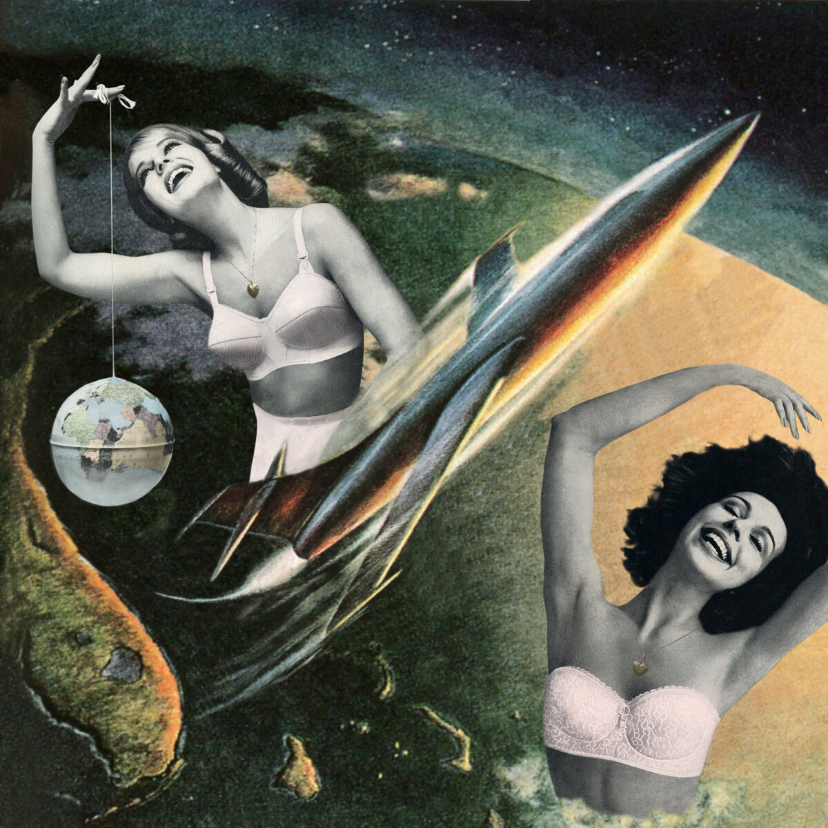
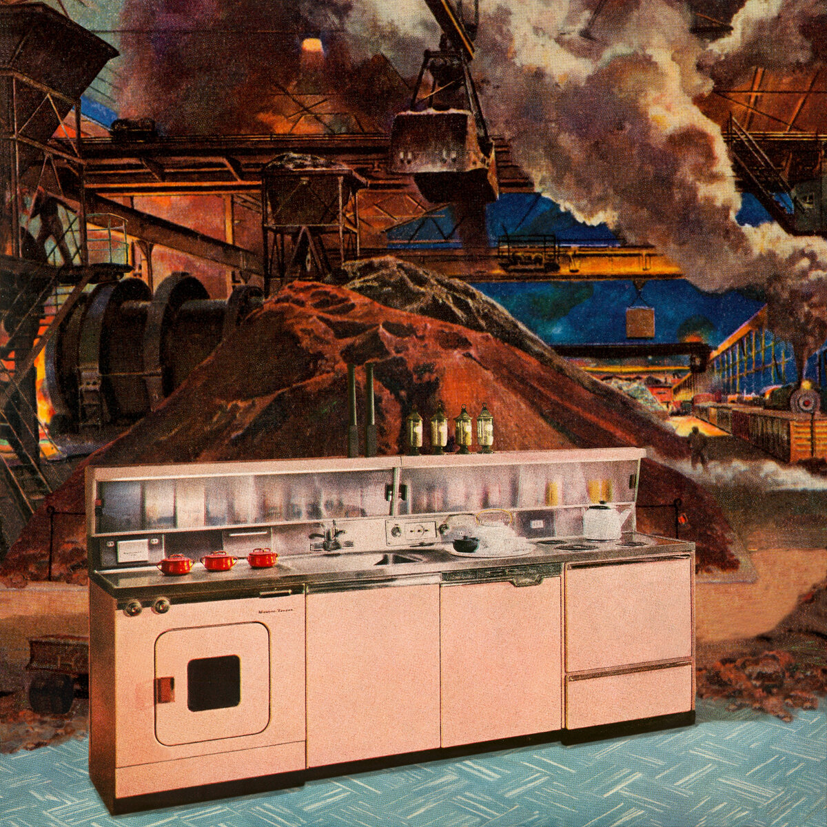
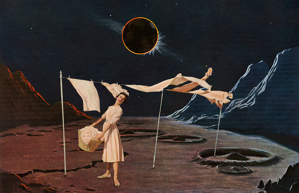
The first collage series was The Pleasures of Modern Living which began in 2004 with a large part done in 2008. The work was primarily domestic settings taken from women’s magazines or scenes of women in some domestic act but placed in outer space. My intention was to blend nostalgia for the past with the darkness beneath the seeming “pleasures.” Nostalgia is for a simple life, a scripted life, where home and hearth were meant to be all. The work showed women alone in their perfect house with perfect children but with a dark sky approaching. One titled The Grand Illusion points to this edge of waking up - all is not well.
One Giant Step was a key piece in the series. On one level, drawing on my own history, it was the triumph of having grown up in this repressive culture, the “happy woman on wash day” and finding her way to a new world. There is grief in this piece - on one hand she’s in the new world but she’s still hanging laundry.
This series was much about learning the technology for making the collages and looking at the period as a whole, with gender being a part of the story.
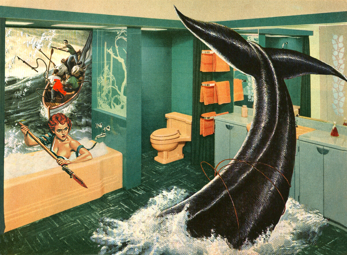
The next body of work was when I jumped off the deep end. True Adventures in Better Homes began in 2010. It was a collision of men’s adventure magazines or “sweats” meets the cool order of Better Homes and Gardens. Adventure magazines were the pulpy underbelly, the rollicking id. Men were going off to war or coming home from war. The surface was beautiful living rooms where everything was “fine.”
Women were depicted in a number of ways and I see them as archetypes. They are the damsel in distress, the Amazonian, the vamp, among others. But when I began I decided to only use the material that was of women and wild animals. The unconscious was leading here but I began to see them as having to do with “wildness,” freedom and a closeness to the natural world. It was a longing to break out of the confines of space and the known world. One is titled Ravished and that element of desire runs through much of my work.
When I showed early work to some of my staunch feminist friends they were horrified. How could I make images with showed such violence toward women?
I still stand by the idea that wildness propelled me. Indeed the making of these images catapulted me out of my nice mid-century home into the wilds, i.e. living on an island in the dead of winter under the stars, with fierce winds and frequent power outages, deep woods and howling coyotes. The natural world was mine to explore, bringing me into my body and natural rhythms.
And the work also had a strong element of humor. I thought these images so over-the-top that they struck me as funny. Humor is a doorway to something deeper.
This series went viral and I think it was something about the archetypes, the dramatic settings, the feel of America and the humor. Young people loved the work, gay men gravitated to the homo-erotic aspect (which I hadn’t seen,) and on and on.
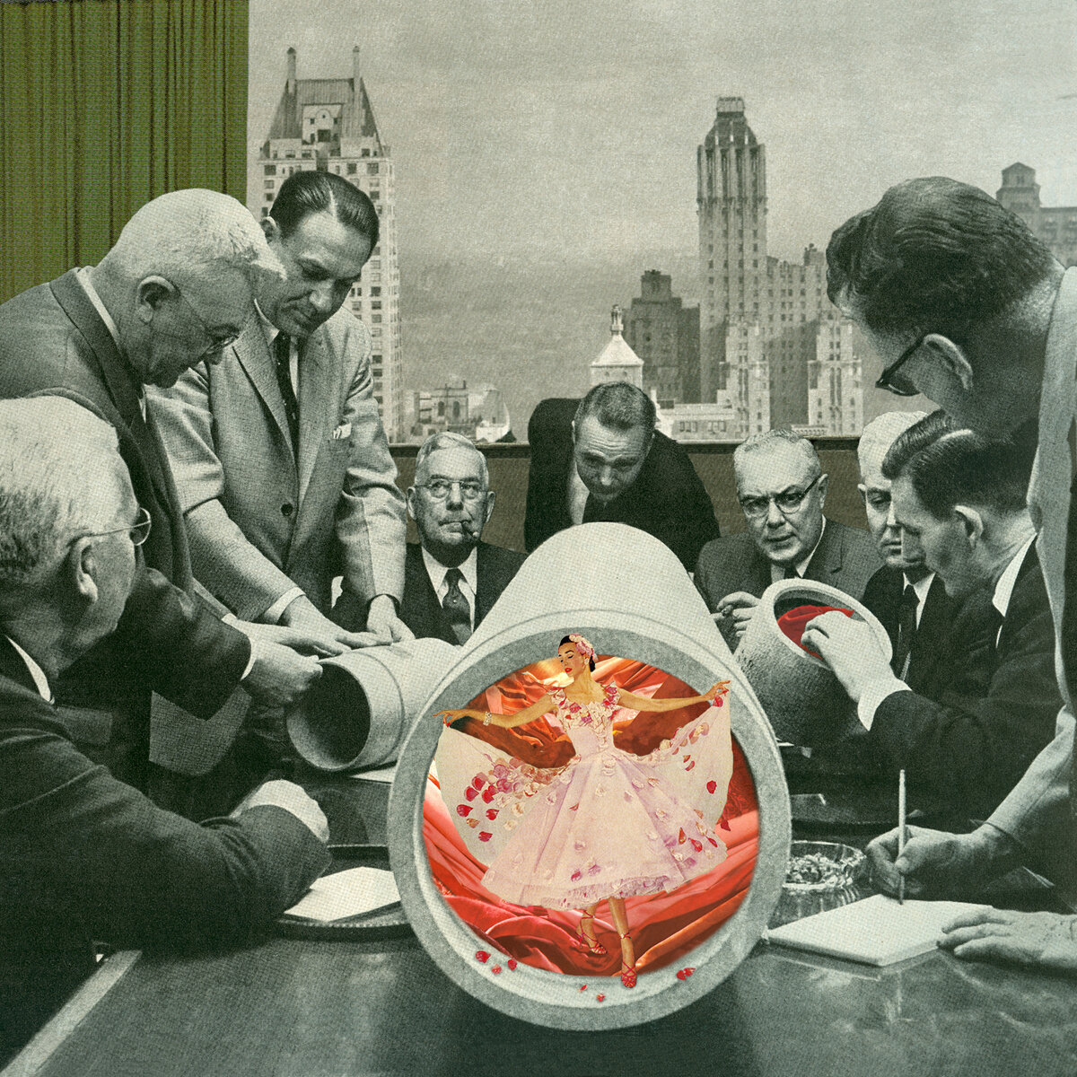
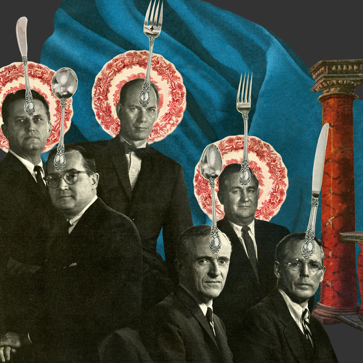
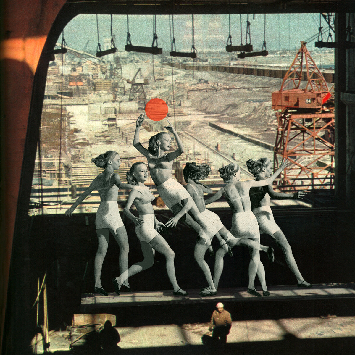
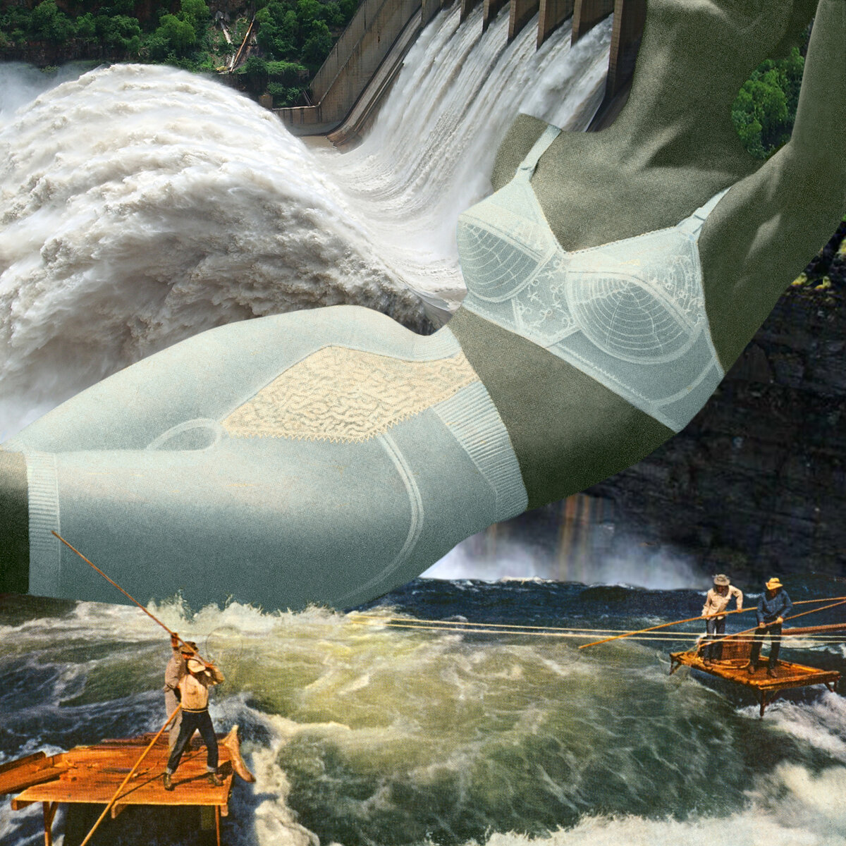
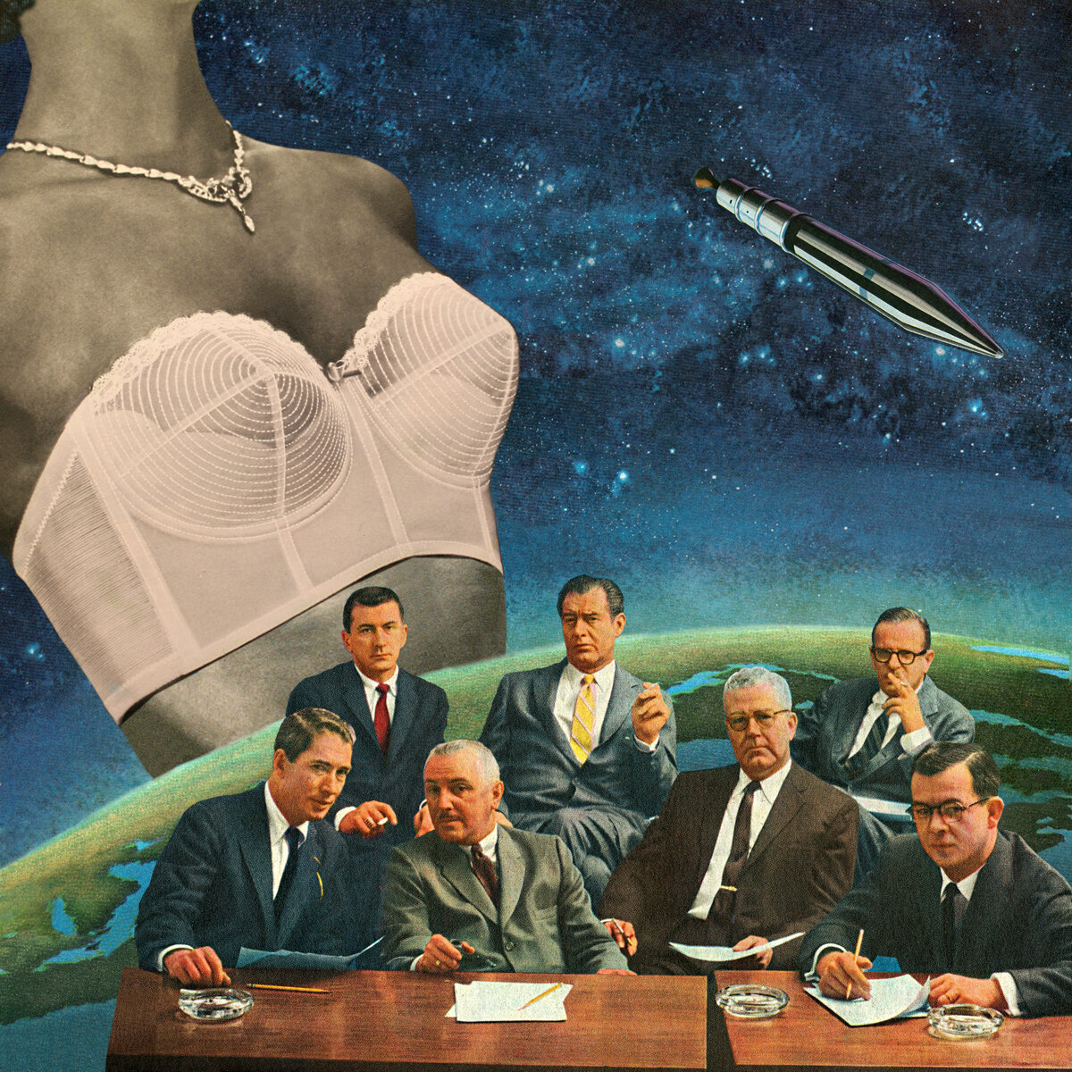
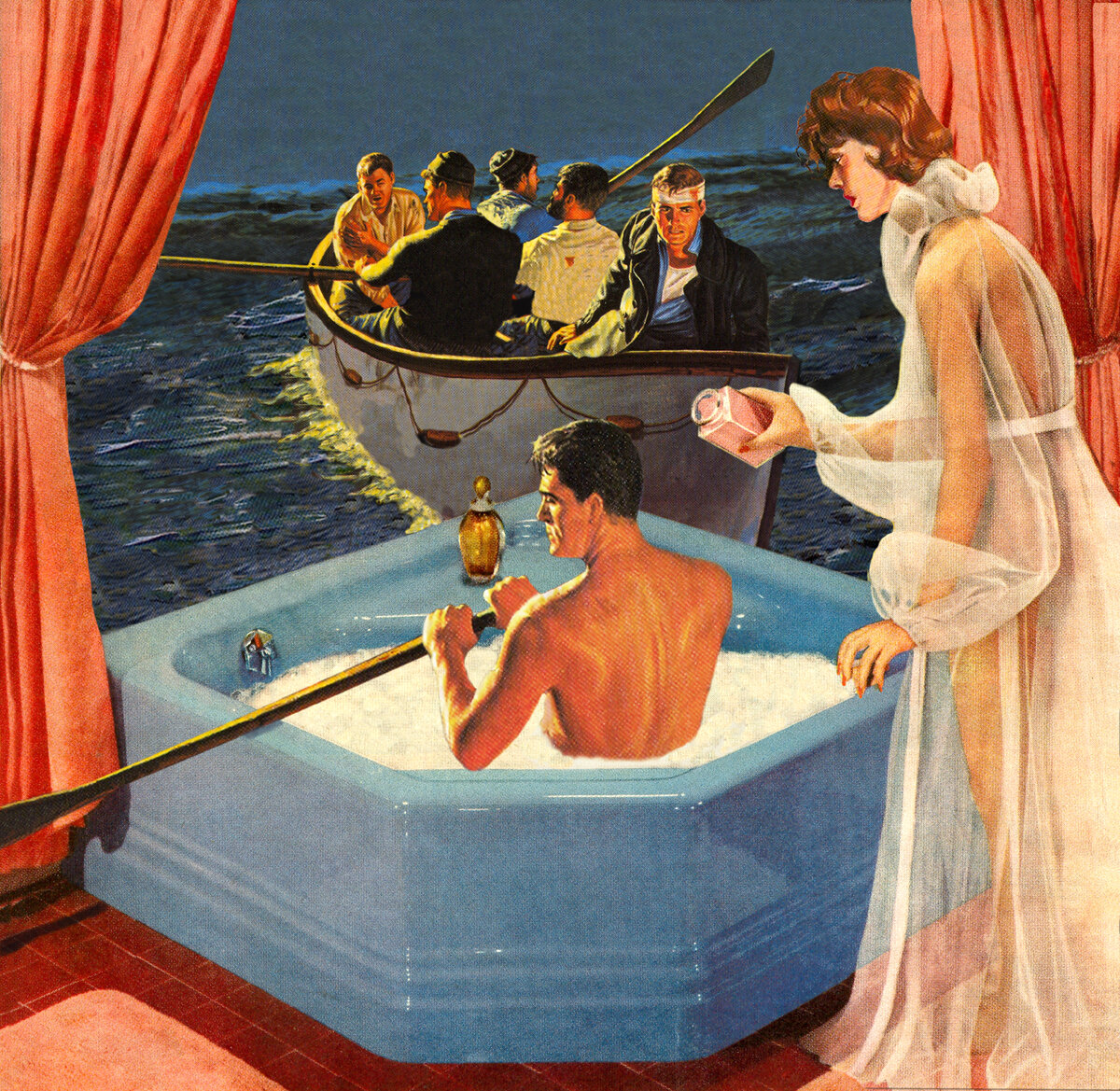
By 2013 I began to want to look more directly at the women in domestic magazines of the mid-century period. Since I’m always pitting two opposites together I decided to put them with the men of Fortune magazine, hence the series title, Fortune and the Feminine.
I was questioning different kinds of power. The women had a joyful, hidden quality in their dreamy interiors, flowing materials and bare flesh. Pieces like Venus Rising and Hydroelectric Power, women are massive goddess figures. I was trying to show the power of the female form. Birth Canal, the sheer beauty of that woman with these serious, slightly befuddled looking men, speaks to this.
I never wanted to go to the easy place of men had all the power and the women were victims in that time period of the 1950’s. I wanted to sort out and affirm women’s power.
Making this series was healing for me. In my statement I wrote, “This series is an homage both to the handsome men in Fortune who look like all the fathers I watched in their big suits and briefcases, carpooling to a foreign land; and to the community of mothers who served egg salad sandwiches on the green lawns of suburbia.”
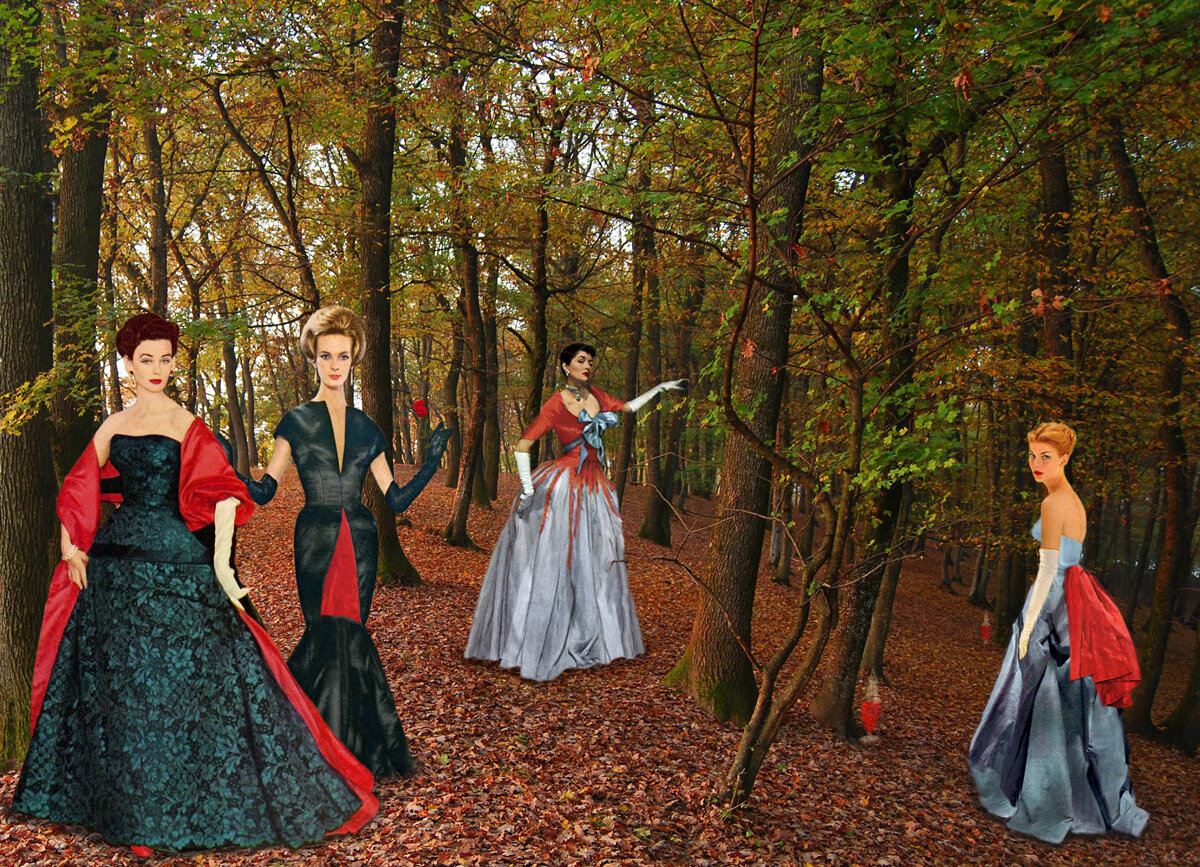
The Modess Women
Entrance
This interest in women’s bodies and what I call the “power of the female form” kept growing. Around 2015 I began work on The Modess Women. In terms of art making it was another leap into territory that was uncomfortable. Many younger women have never heard of Modess sanitary napkins.
I wanted to show in my art the power in bleeding. My view comes from years of study with indigenous, earth-based cultures and long-time research on the iconography of the feminine through mythology.
I grew up with the Modess ads. In looking at them closely again I found the women beautiful in their haute couture but they were as far away from the body and bleeding as possible, in a word, “sanitized.” This collage series is meant to reclaim women’s bodies, especially in these politically charged times when women’s rights are challenged.
The feminine theme of descent is in the series, beginning with The First Night in the Woods. Ritual is key, making offerings, shedding, entering the cave, the darkness. It’s a journey into the self, to shed, i.e. transform and begin anew.
I watch the new marketing of feminine products and portrayal of women in advertising with interest. Now young women employ the archetype of the female warrior, calling upon strength, fight, blood. The pendulum swings. I wonder if some sense of the riches of interiority are lost.
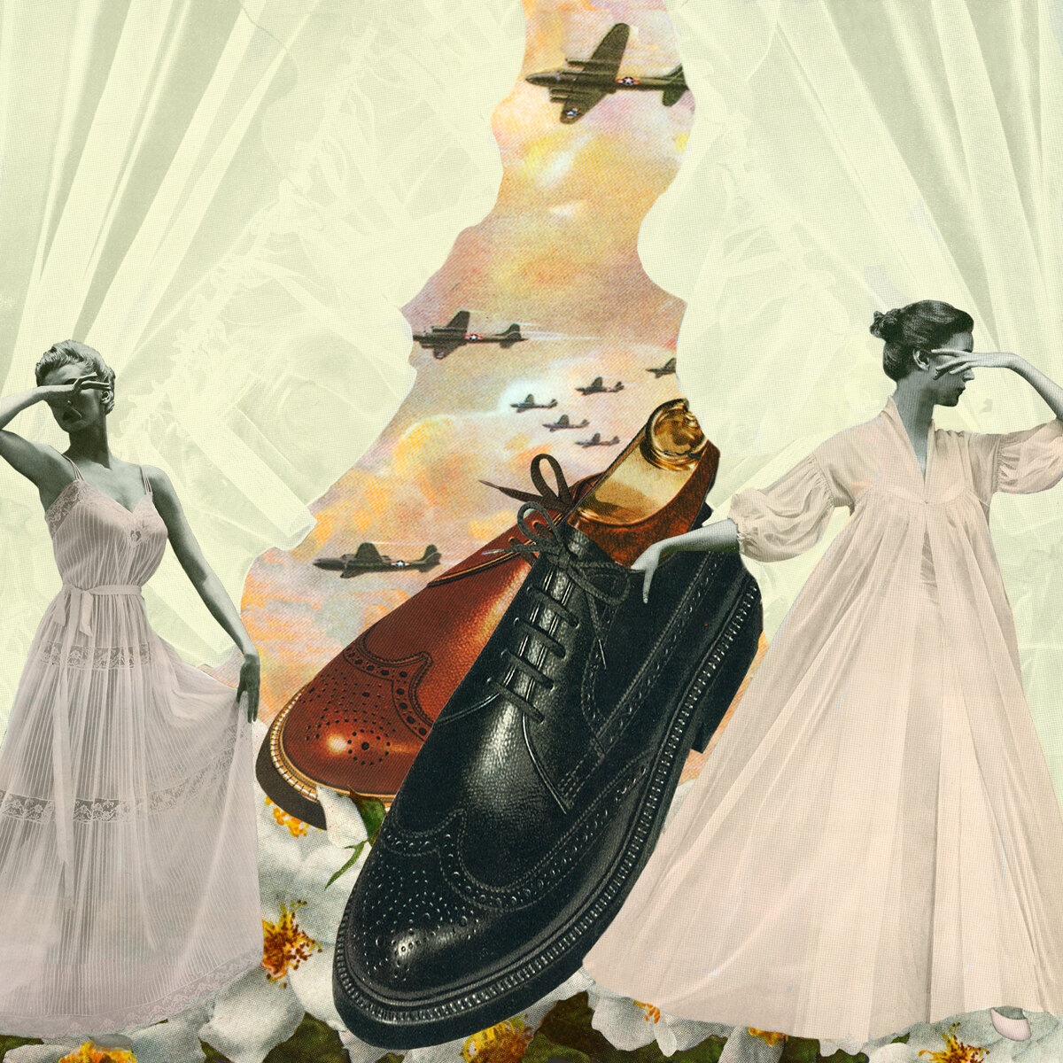
My recent work comprised two series, the major work is titled They All Looked At the Rain. I began with wanting to say something about the climate crisis and ended up concentrating on the element of water. This is a more abstract sense of the Feminine but the element of water is by most systems, whether Chinese medicine, Jungian psychology etc., rooted in this notion of water as feminine. Water as emotion, flow, birth, life.
I was breaking out in this work by moving to hand-cut collage, a more sensory experience of materials. I was also experimenting with styles. This was a kind of permission giving to “make what I wanted to make” and hope it would all connect to make a coherent series.
Functions of Vagina
Functions of Vagina was a surprise piece, working with an old medical text and shaping a collage that still holds a certain mystery for me. Long ago I had worked as a birth doula for a few years and this theme of womb and birth is always with me. The power of the Feminine to produce life is here, the mystery and sacredness. This is shown as well in the Tree of Life, and the dire straits we are in as a planet.
The second series is called Catalogs of Desire. I’m looking at the Montgomery Ward catalogs from the late ’40’s, early ’50’s to address “desire.”
In Home Decor I juxtaposed the neat, sepia-toned pages of domestic things to buy with the erotic, putting the former pin-up, Bettie Page, bare-assed and posed on a mattress. High School Dreams of Glamour shows the longing of a teenage girl.
The Mother of 10,000 Things is an honoring of the womb through which all life comes forth. Again it is a juxtaposition of a woman from the catalog and a medical drawing of the womb.
HG: Back to the Photolucida where people were having a hard time understanding the work. How did that affect your creative process? I've had this happen several times where I don't get someone's work and struggle to understand. Many people take offense to this but I would rather be honest and work to understand. Reviews are strange (and wonderful) events. Expectations often don't meet reality. Yet, I have found over the long haul great work and good relationships end with remarkable results.
NB: I’m so enjoying being able to have this conversation, Hamidah. Back to Photolucida! I’m glad you were honest and challenging, that gave me a lot to consider. Part of our conversation was your view that the women in True Adventures were being raped. That surprised me as it was so not how I saw it. These illustrations were out of the unconscious of male illustrators’ fantasies and fears. I saw it more as domination and fear of their own impotence. I was not seeing the women with wild cats in a literal way but metaphoric. And I didn’t care what the original intent was.
Also, from the vantage point of collage, one is always commenting on or engaging with some other context or previous time. The minute you glue down a piece, in this instance from an old magazine, you are reconstructing a narrative. That series is an open narrative for the viewer but on a personal story level, as I said, I was working something out about “wildness.”
I experienced so much positive energy from my time at Photolucida. I was re-entering the photo world after a long time away, with images I wasn’t even sure were photography. I remember crowds of people mesmerized by the work when shown to the public in a walk-through. And they were laughing. I wasn’t the only person who thought these were full of humor! One reviewer said with great enthusiasm, “This work is a fantastic, fully-realized body of conceptual art...but I only deal with lens-based work.” So, I knew I’d gotten something right.
The experience juiced my creative process. I felt emboldened and stayed with the True Adventure series for two more years, through 2013. Part of what kept me going was the overwhelming response to the work worldwide.
The themes expanded to show woman as caretaker in Spa or Amazonian women in Weekend Retreat. Overall, and probably from my background in psychology, I saw the work as looking at what lies beneath appearances, what is hidden, the underbelly. Of course, this includes socio-political dimensions.
Whether it be as a therapist doing soul work, the artistic process, or women’s spirituality, it seems to be what I do. I will add that from a feminist perspective this “descent” into the darkness is also where the riches are.
HG: This method you use of pairing is important to add depth to the work. Realities don't exist in a vacuum. Women's so-called place in the home didn't exist on its own. We live in a world of multiplicity, duality, intersectionality. If I am correct, the women in your worlds are middle-class white women (for the most part) Is that focus due to the advertising that you grew up with or something else?
NB: That’s right, the women are white, mostly middle-class. It’s certainly the world I grew up in and the advertising of mid-century America.
I grew up in white suburbia while people of color lived in the inner city. I remember the “race riots” of 1964 in Rochester, NY and feeling like we were on a different planet. It wasn’t until I moved to Washington, D.C. the wider world opened to me.
The women’s “place in the home” comes from all magazine advertising of the day, (and all the mothers I knew who thought it demeaning to work.) My interest in advertising is in the family DNA. My older sister cut out and collected ads. Later she worked in large advertising firms (she was the character of Peggy in the Mad Men series.)
Maybe her influence peaked my early interest in advertising. When I was eleven or twelve I would stage and photograph my version of Salem cigarette or Dove soap ads. That’s what photography was, right?
In working now with magazines as an artifact of that period, I’m fascinated, sometimes appalled, at the encoding of messages. My collage White Super Power (Fortune and Feminine) is from an ad for a cleaning company named White. Or in the collage Supremacy (Modess series) an ad for a white Cadillac has the banner “Supremacy.”
So much of my art has been driven by looking at where I come from, but also the times we live in where truth and facts are mangled every day.
HG: Thank you.
NB: Thank you.
All images © Nadine Boughton


