Q&A: Christa Blackwood
By Hamidah Glasgow | December 31, 2015
Christa Blackwood is a photo, text and installation artist working with themes related to identity, history, and popular culture. Her visual voice was developed while a student at New York University, when she began producing street installation art such as Butcherknives (1991), a work that addressed issues of sexual violence. A chilling juxtaposition of billboard-like close-ups and text from poet Michelle Kotler, Butcherknives, was plastered all over the streets of lower Manhattan on the evening that the William Kennedy Smith verdict was announced. The poster’s timely and provocative appearance resulted in heightened critical attention for Blackwood, including an invitation to join the Women’s Action Coalition (WAC) from renowned artists and scholars, Kiki Smith and Lucy Lippard.
Her dream-like sequences and texts employ multiple techniques and methods, fusing traditional, historical and alternative processes with IPhone image-making and street installations. Blackwood received her MA in Studio Art from New York University and a BA in Classics from The University of Oklahoma. Her work has been featured in several publications including The New York Times, NYQ, New York Newsday, The Village Voice and The Chicago Sun Times. She has exhibited in galleries and museums throughout the U.S. and abroad.
Hamidah Glasgow: I thought that we could start with your early years in guerrilla art and the motivations behind that work. Who or what were your mentors/motivators? Tell me about the work itself and how you carried out the implementation.
Christa Blackwood: Growing up as a teen in Oklahoma and attending undergraduate school at The University of Oklahoma in the 80's, my social niche was a hybrid of nerdy creative types-art school kids, classics department students/professors, college radio folks, the DIY post punk bands, that made flyers, posters and graffiti to promote their work. They were my first mentors\role models for self-expression. When I moved to NYC in the late 80's the city was in economic turmoil, awareness of the AIDS crisis was peaking and there were renegade spaces available-store fronts/empty gallery spaces/abandoned buildings for artists, bands and art collectives to utilize/nab.
The first poster that I made came out of an assignment for my first Black and White Photo I Darkroom course at NYU, which was subtitled Subversive Perspectives. I worked for NYU as a copy photographer for the art history department for 7 years and took advantage of NYU's tuition remission program, which offered to employees that had been accepted and matriculated at the university tuition remission. I could take 2 classes per semester and during summer for free. I flitted around and took classes at the anthropology, art history, journalism, photo and art departments/schools. One of our first assignments for Photo I/Subversive Perspectives was to create a design/mache for an art billboard project. Using my photos and design along with my friend, author, poet and Community Word Project Founder/Director, Michelle Kotler's text-
his face I do not recall, but his hands butcherknives
we created the Butcherknives image. The design was selected for the billboard project, but the financing fell through, so it was never made as a billboard. This was the fall of 1991, simultaneously, the infamous rape case, The William Kennedy Smith trial was on the front page of every paper each morning and broadcast around the world and brought into our homes every night on the 6 o'clock news.
I felt like the billboard design and message was something that needed to be seen, so I scaled back the proportions and made 200, 17x22 inch silkscreen posters, which my wonderfully enthusiastic and supportive friends and I plastered all over lower Manhattan the evening the verdict was announced. The poster's timely and provocative appearance brought me some local media attention and an invitation to join the Women’s Action Coalition (WAC) in it's infancy. WAC was a feminist direct-action organization, with and idealogy similar to ACT UP (the AIDS Coalition to Unleash Power) was founded in early 1992 to fight discrimination against women. Its members held colorful demonstrations in support of women's rights, using drum corps/colorful graphics and the slogan "WAC is watching. WAC's signature "blue dot" logo was modeled after television's way of obscuring rape victims' faces on camera with a blue dot.
HG: It seems obvious to me that that your early work is an artistic thread that informs your recent and current work. Is that accurate?
CB: Most definitely, yes. Upon seeing a recent poster and recent work of mine, an old NYC friend and art colleague some of my newer work and posters said, "you've been saying the same message forever." I shrugged and snickered and said, "it still needs to be said." The idea behind the work is what's most important to me. Technique is important, the element of surprise/wonder is equally important, because it's important to draw people to the work, but the idea still sets precedence.
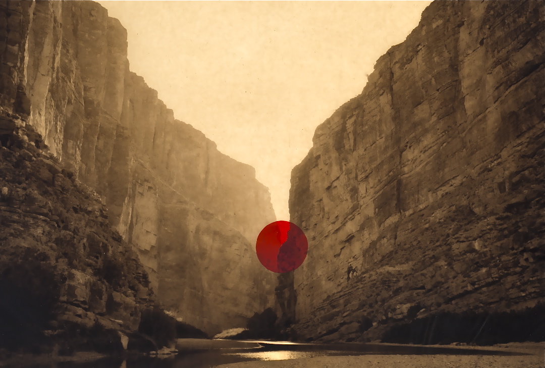
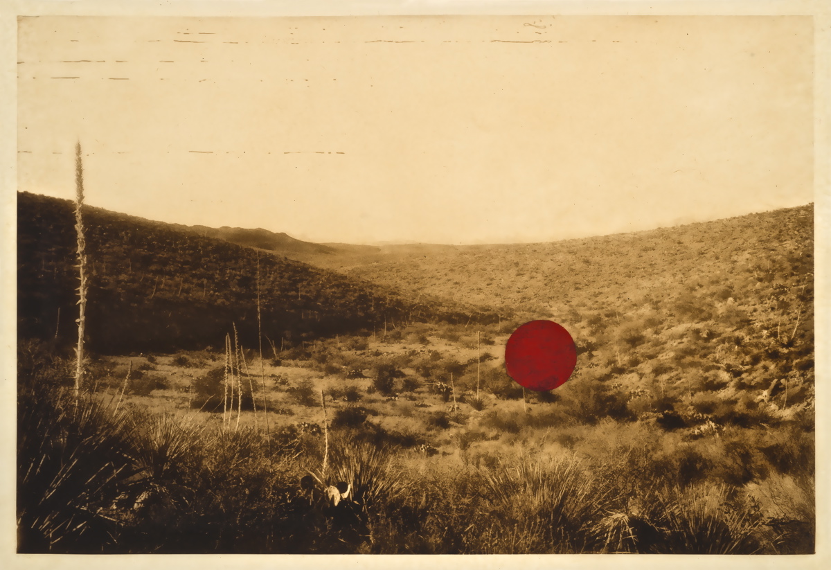
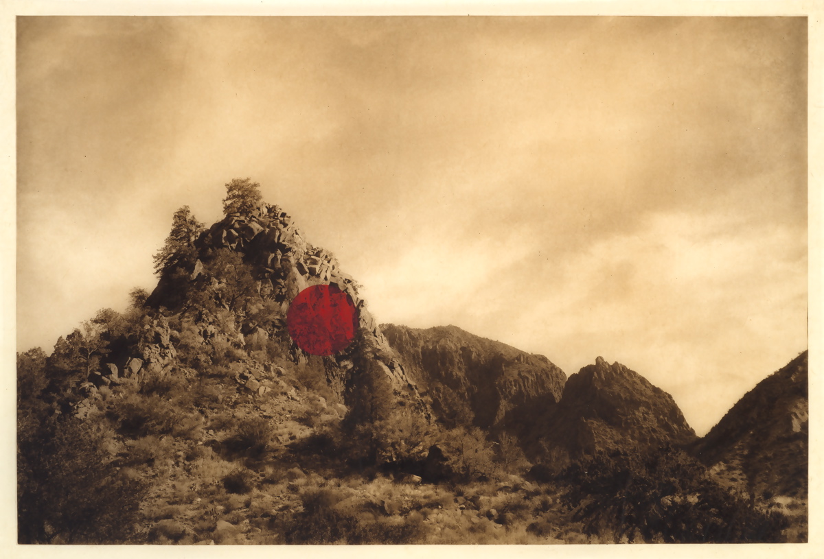
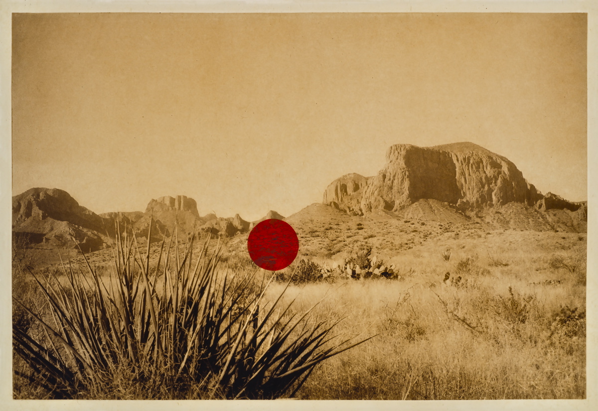
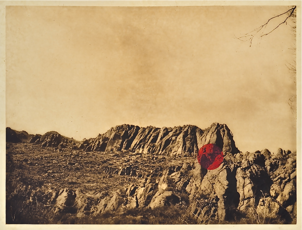
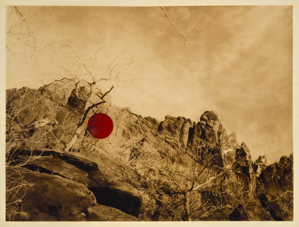
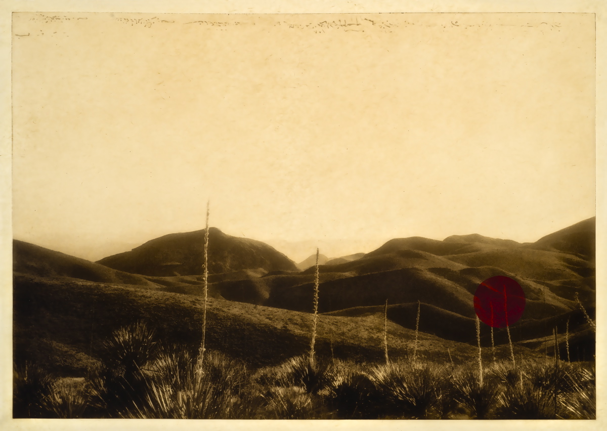
HG: Naked Lady: a Dot Red is such powerful work in conversation with the problematic past of objectified nudes in the landscape, tell me more about this.
CB: It's a theme that I've been aware of and sensitive to since I took my first photography class at 12 years old. I was really was drawn to photography and told my parents that was what I wanted for Christmas, photography instruction. On Christmas morning I opened my gift wrapped rectangular shirt box present and inside was one hand knit hat and a flyer advertising a photo class that meet Wednesday evenings from 6-9pm at the community center at the fair grounds in OKC.
Photography classes for children were not available then so I took an adult class, made up of a male instructor and five students: four middle-aged men and me, a pre-teen girl. Two of the guys in the class took traditional landscape photos of the surrounding countryside. The other two took nude, boudoir-style photos of young women. Neither of these subjects were appealing to me. I couldn’t drive out of town to take scenic pictures because I wasn’t old enough to drive. And I certainly didn’t want to ask my mom or my best friend’s mom, Mrs. Holloway, or anyone I knew to model like that. It was an awkward time for me, but it didn't seem awkward for the other students. It just seemed like the norm or unquestioning status quo - men were photographers and women, young women were their models.
It is still the same thing in terms of representation today- in workshops with prestigious renowned photographers, in gallery exhibitions, in contemporary photography books, print, magazines and online in photo forums, particularly in the many alternative process or historical process groups/forums/exhibitions
HG: The red dot is symbolic of the objectified nude woman in the landscape and also the symbol for sales in the art world. Can you talk a little bit about that?
CB: I see the red dot as a metaphor for many things-
a marker for the commonly found female figure in historical and contemporary pictorialist photography and 99 percent of the "figure in the landscape" photography images
commodification of images-the little red dot sticker that denotes a piece as sold in a gallery
location identifier, the "you are here" red dot on a map. My take on it is more, "you are still here"
Additionally, the color red itself has so many metaphors-
blood,
menstruation,
the mouth-our means of verbal communication,
lips
lipstick
The red that I use for the dot is a blue red and mixed to replicate the hue of a couple of department store lipstick shades - Pirate by Chanel and Tres Tres Dior
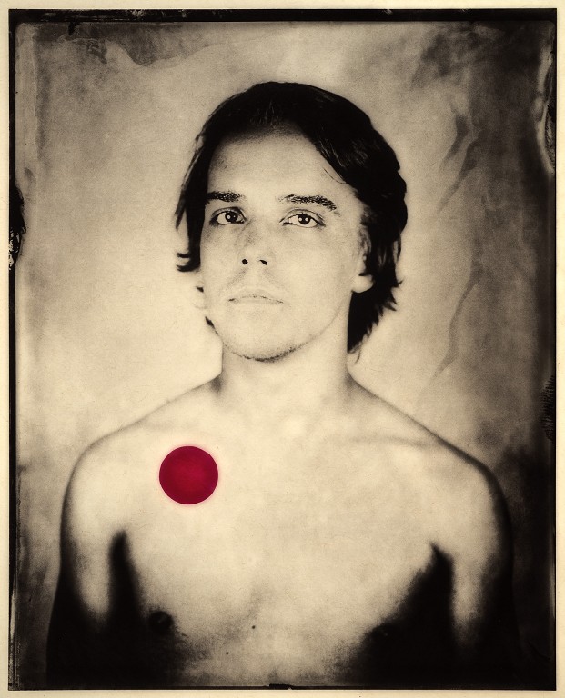
HG: How did the Collodion boys arrive? What was your inspiration for creating this series?
CB: I received a tremendous amount of feedback from the landscapes, Naked Lady: A Dot Red, mostly very positive and supportive, but I still get some responses from folks that just did not get it conceptually or are dismissive of the idea. They wish that the dot would go away.
There are still many people in the photo world that cling to a certain formally in their sensibility of what a photograph is or should be pristine-no marks or visual embellishments, full frame, matted, framed and presented the same way, The ink color is not black or sepia. Some of the responses from traditional photographers were: It's a print made on an etching press-you are not a photographer, you are a printmaker. And responses from printmakers sometimes were, it's a photograph, not a print, you are not a printmaker.
The formal qualities of photography and printmaking only appeal to me in terms of impact for the viewer. What makes the viewer drawn to the work? What makes the work dynamic or compelling? I could care less if an image is full frame or printed with a traditional color ink. That way of thinking is pure pedantry.
The Boys of Collodion was my second attempt to address the same issue-the representation of gender in photography. The approach is more direct. What if I reversed the traditional photo lens of the male portrait/boudoir photographer with the young female model? A female photographer with young male muses? What if I carefully selected and photographed only young men and selected them for their beauty/physical attributes-keen and symmetrical features, slenderness, clear and supple skin, their youth?
HG: It seems to me that the red dot's meaning is morphing with this newer series. Is that right?
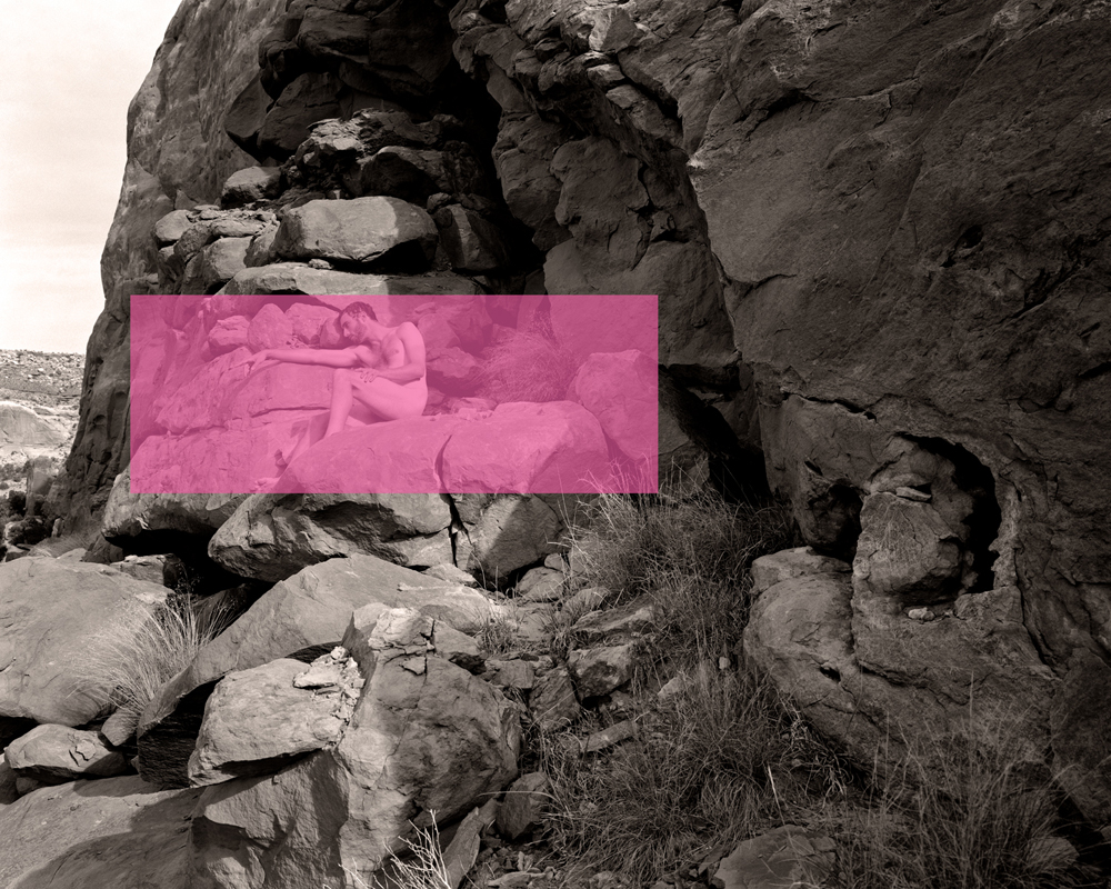
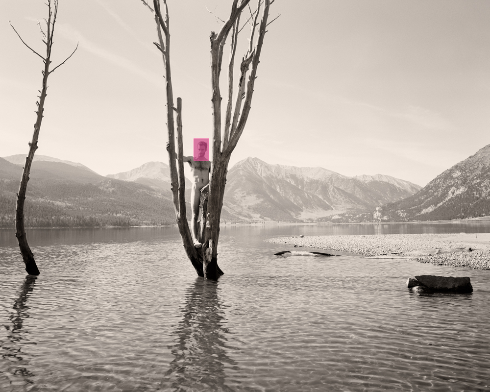
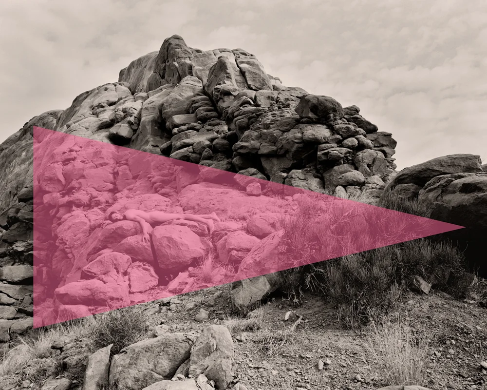
CB: Yes, most definitely. The new series, Prix West, which I began in the summer of 2013 is mostly, about 90 percent, shot on scenic locations in Texas, New Mexico, Colorado and Utah with large-format, film-view cameras & and a couple of male models. The work stages the nude male body within the majesty of North America's gorgeous western landscape, and situates it in a genealogy of classical photographic studies of the human figure. There is a bit of studio work(maybe 20 percent of the series) which plays homage to the classical nude photographic studio work of Weston, Newton, Stieglitz.
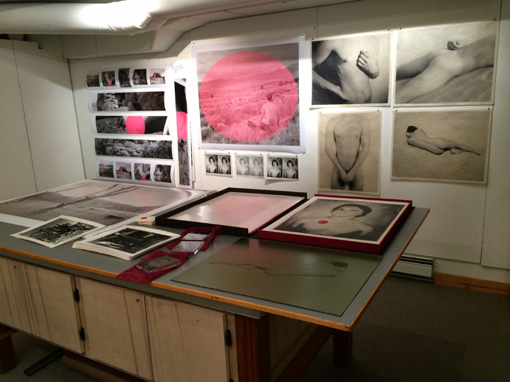
The studio images are printed by hand on a french press with 20x24 inch photo etching plates. The figure in the western landscape images are being printed digitally at 32 x 40 inches.
All of the images were made with large format view cameras and hand processed film. I just finished an artist residency in Colorado at Anderson Ranch and printed many of the Prix West images there, first as 11x14 silver prints, but then I felt like I really wanted to present the work differently-larger, maybe a bit more contemporary, so I scanned the 4x5 negs, put them in Photoshop, made some minor adjustments-no sharpening or big changes, and then embellished each image with a different pink graphic motif. It's pretty exciting to see the work printed that large and I give a huge shout out to Ian and Rick, the wondrous digital photo gurus at Anderson Ranch.
HG: In Prix West, geometric shapes expose the figure; bring the vulnerability of them to the forefront of the image. They expose the power dynamic present in making images of nudes. Thoughts?
CB: The geometric shapes in the most recent work always highlight the nude figure, but often highlight & conceal the figure simultaneously. They draw attention to the nude and also obscure some of the individuality of the model, homogenizing the figure, which makes the viewing more palette-able. We are not confronted directly with their gaze.
HG: There is a luscious quality to these images that at the same time feels voyeuristic and uncomfortable. Figures in the landscape, now young men, serve as a replacement to the all to common vulnerable and forlorn women. Thereby putting the men in the same position that women have been placed for far too long. Strangely, I have a sense of being lured in, at the same time that I feel that I shouldn't be looking. This uncomfortable feeling is that I am in control of the figures.
CB: Ooooh, love that, love your take on the new work! That's a very astute comment. It is about control/power. Who's in charge? Who gets to call the shots,,,,
HG: Do you have an overarching driver that moves your creative endeavors?
CB: Yes, indeed, I am fascinated, maybe a little obsessed by visual culture's representation of gender and the power dynamics behind that presentation. How we present ourselves.
When does cultural conditioning become second nature, muscle memory, mirroring?
How can we break this down, recognize it and choose better ways to represent ourselves?
HG: What is next for you?
CB: A solo exhibition, Prix West, opens next month at Photo Method Gallery in Austin, Texas. The work presented will be a mixture of printing styles-large scale digital prints, hand pulled photogravures, cibachrome transparency, and if finished in time, Super 8 film projections. All of the still images were shot with my 4x5 view camera. There's a couple of group exhibitions coming up, You are Here: Texas Photographers respond to the Texas Landscape, which will be exhibited in conjunction with Fotofest 2016 in Houston and at The University of Texas, A&M, in College Station. There's a large annual small works group show in NYC, Postcards from the Edge, that I am always happy to have work in and benefits the dynamic non-profit outfit, Visual AIDS.
I have just returned from a 10 week Artist in Residency appointment at Anderson Ranch in Snowmass Village, Colorado and while in there was given an invitation to participate in an artist in residency program in Argentina for 2016.
HG: Wonderful, congratulations on your success.
